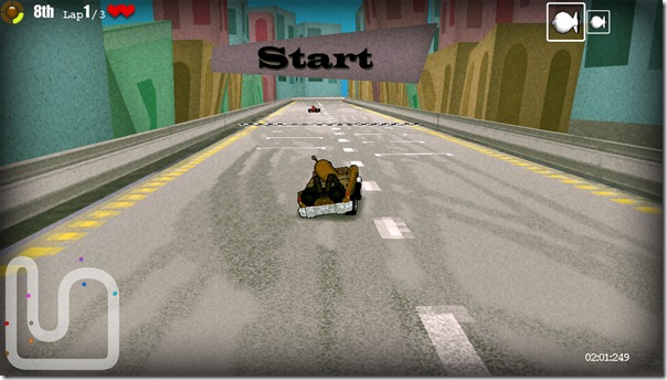
I’ve always been searching for a distinctive visual style for the backgrounds in Dirchie Kart, some of the tracks look alright but don’t really separate my game from it’s source material.
Today I’ve slapped together a test background decoration around the new Monaco track of a textured cartoon idea I’ve been thinking about. So far I’m really happy with the look, it’s nice and quick to put together as well.
Let me know what you think?

Looks good. Makes all the graphics look more consistent.