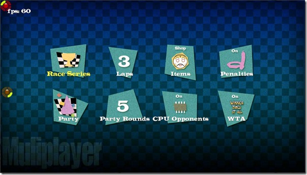
This week I knocked up some new menu graphics for Dirchie Kart – World Tour, I’ve been focusing on creating a consistent visual style from start the finish and the old menu was obviously not doing it.
Since early this morning I’ve been hammering out the code to get it all working in game, above is a show of the new multiplayer options screen, heaps better than the old one I’m sure you’ll agree.
I still need to come up with a good concept for displaying you general progress through the game modes on the main screen but I’m stoked with how this is looking so far.
