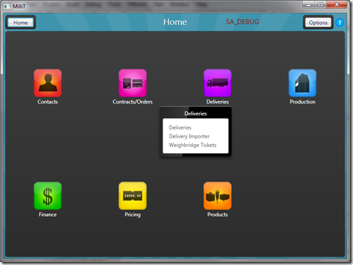
Even though I’m nursing a sick baby today, I’ve managed to get those icons implemented into the admin program. I knocked up a custom ItemsControl with a BitmapImage and Title dependency properties, that has an Image with the TextBlock and a popup within the overwritten ControlTemplate.
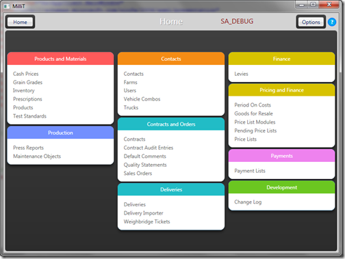
The net result is the app “Home page” has gone from this horrible mess (Admittedly I let it get pretty bad because I knew it was going to be replaced):
To this:
I also coloured and overlayed some stripes to the outer border, the stripes are a reference to the program icon and I think the colour helps separate the application controls from the content controls within the navigation pane.
I’m happy with the overall visual design of the MilliT app now, the weighbridge client needs a little attention next.

