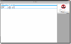
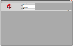
I had a great design session yesterday styling up the navigation/view/model app framework I’ve been designing as the basis for the administration program at the mill.
One thing I’m still struggling with is how to effectively handle the huge difference in screen real estate between 1024×768 and 1680×1050.. more than twice the pixels on the screen. The challenge is to not just to make it look half decent but to actually utilise the extra space for displaying data.
Who knows what res we’ll be running in 5 years time?
This is my first draft, my Widget object only has a hand full of fields so really struggles at high res.
Search/Select Screen
Edit Screen
I’m happy with the 3D grey tones, I think I’ve struck a nice balance between looks a function, everything white is pure data, anything intractable is bordered in mid Grey, anything darker is background. I don’t think it’s too heavy, the grays aren’t that far off your standard windows schemes.
With the edit screen I tried a set width on the group borders in a WrapPanel instead of a stack panel, I think that coupled with some zoom controls might be the ultimate solution.
More to come.


