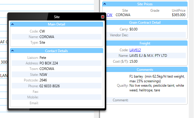
Easing myself back into work this morning with a few general updates around MilliT and the new Weighbridge client, there’s probably a hundred other more pressing jobs to do but I got side tracked with a little visual refresh of the hover over popup controls (which I blogged about some time ago http://www.brownbot.com/XNABlog/?p=325).
Here’s what they look like now, I think the black makes it really obvious that they’re separate to the rest of the app, the wanky iPhone like gradient adds some contemporary design fluff.
For any of you WPFers out there here’s the style code.
<LinearGradientBrush x:Key="PopupBorderGrad" StartPoint="0,0" EndPoint="1,0.2" >
    <GradientStop Color="#FF242424" Offset="0"/>
    <GradientStop Color="#FF383838" Offset="0.4"/>
    <GradientStop Color="#FF000000" Offset="0.401"/>
    <GradientStop Color="#FF000000" Offset="1"/>
</LinearGradientBrush>


<Style x:Key="PopupBorderStyle" TargetType="{x:Type Border}">
    <Setter Property="CornerRadius" Value="5,5,5,5"/>
    <Setter Property="BorderThickness" Value="0,1,0,0"/>
    <Setter Property="BorderBrush" Value="#FF888888"/>
    <Setter Property="Margin" Value="10,0,10,10"/>
    <Setter Property="Padding" Value="5,5,5,5"/>
    <Setter Property="Background" Value="{StaticResource PopupBorderGrad}"/>
    <Setter Property="SnapsToDevicePixels" Value="True" />
</Style>
