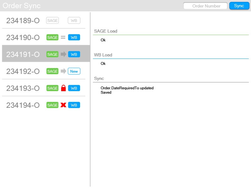
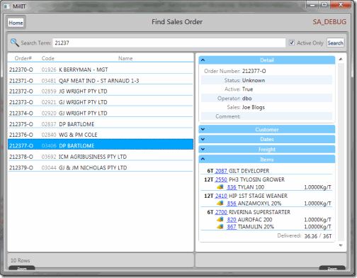
Here’s the first draft of the new order sync UI design, basically it has to preload either a single order (if there’s a number entered) or all active order numbers from SAGE, then individually load up the Weighbridge version, compare the two versions (checking the production status so we don’t change anything we shouldn’t), merge the two if everything looks ok then save the result back to the weighbridge.
If I’ve done my job right you should be able to guess the status of the different order sync operations (ie No change, updated, created etc). Each step in the operation returns a validation result (with an error message on failure) but can also log warning and informational messages via TRACE calls (basically console messages). All these messages will be captured by a SyncOperation object which the list is bound to.

I’m happy with the list view but not 100% on the detail view yet, I might revert back to bordered expanders like the other viewmodel stuff I’ve done. This was all done in Photoshop so it’ll mutate as I implement the WPF code.
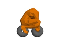
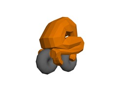
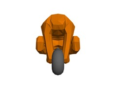
Started to go a bit nuts hanging around the house by myself today, got some good work done this morning but after the big work party late lunch I couldn’t face any more code, so I fired up Max and started plugging away at a model for the escape pod idea I’ve had on the back burner for a while.


This is a pretty good start, there will eventually be an actual bike, it’ll do for a rough implementation to see if the idea is any fun to play.
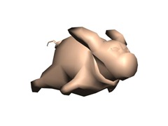
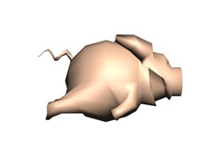
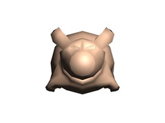
What was intended to be a quick session to knock up a placeholder model for the Truffle Hunter (a large flying pig that incessantly hunts down the player currently holding the Truffle) turned out an almost complete model. Still needs some texturing but the model turned out better than I planned.


If you’re wondering what the hell I’m going on about… The truffle itself starts out on the track, the hunter doesn’t swing into action till someone accidentally or intentionally runs over it. The truffle can be passed on to another player by ramming their car.
It should add another layer to the racing game play.. now back to the code so I can see it in action!
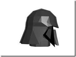
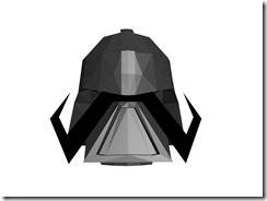
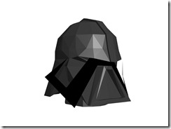
I present to you the first draft of Dark Dirchie (He was going to called Dirch Vader or Darth Dirchie but I’ve got no idea on the legalities of doing a parody so I figure I’d better air on the side of caution).


He’s going to the number on Dirchie to beat, I’m going to pump up his AI’s elastic banding to the best racing line and boost his karts weight so he’ll be a formidable opponent.
Code wise I’ve added AI Dirchies to fill out the party in single player mode (optionally in multiplayer), this streamlines the game design to only the party mode which narrows the goal posts for me completing the game, but puts more emphasis on me getting the AI “right” to make a compelling single player experience.
I also woke up with a “eureka” moment, as I realised how to solve a bug I introduced into the collision system with my garbage collection optimisation.
We’re getting there.
Here’s what I achieved this week, a new set of providers and read only UI for our sales orders.
None of it is particularly remarkable, but I’m happy that my MilliT view model client code doesn’t suck yet (all code will eventually suck, it’s just a mater of time), actually I find it quite a nice place to spend the day coding WPF. Only a day to fully lay out a snazzy looking UI like this is pretty cool I recon.
On the provider side (boring!), I’ve set out a nice standard structure for all these more complex hierarchical object providers, which will help me a lot when I tackle the big kahuna schedule objects next week.


If anyone has any more suggestions (the sillier the better) leave me a comment?
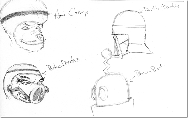
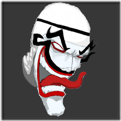
While I’m waiting for my machines to catch up I thought I’d blog this little doodle from the other night, each character/head type has 3 main art assets, the model and texture as well as a 2D splash.
I’ve been keen to get back into some pencil artwork to get off the computer for a bit so the splashes are going to be like the following, a slightly rough pencil sketch scanned into photoshop for shading and then a splash of colour.
 This is what it looks like in Photoshop, you can’t really see it but there’s a slight blue tint to the face, that is to mask the face off from being coloured.
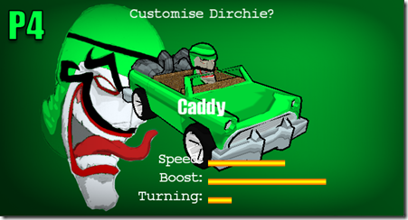
I’ve got a custom pixel shader that tints any part of the picture that is pure gray scale with the Dirchies selected colour.
 This is what it looks like in game, I think it has a certain charm to it.
If anyone has any ideas for characters I’m all ears, I’m currently working on a Dirch Vader and Afro Dirchie, I’ll need at least 8 all up.
