The latest beta of expression blend comes packaged with the full "Expression" suite of tools, I’ve been interested in checking out "Design" for some time to add some flare to my apps.
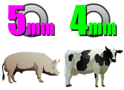
I’ve been playing around with it most of yesterday importing and animating a new loading control, this morning I got stuck into some vector images I need for my app, namely a pig and cow.
The results are below, anyone who’s got any proficiency in Photoshop or even old Corel draw will be right at home, it’s all splines and bezier curves. So far I’m impressed, it’s super easy to export from Design, add it to your project in Blend then drag them from the resource view into your button template or control.
 I’ve had performance issues with my new PC since day one, it’s been all over the place, one minute it’d rip a video at 45FPS next it’d be down to 2FPS, I was thinking it was heat related but sticking a fan in front of it didn’t help.
Next I reseated everything, no joy again. Today I got fed up with it and pulled out the video card, figured I’d try the most basic setup first, and low and behold it all started working well.
Who would have thought this intel integrated chip would be faster than an Nvidia card, it was some weird memory thing I think, anyhow it’s flying like a quad core should now, ripped the same video at just over 80FPS.
I quickly popped down to the place I bought the PC from to swap the video card over and he was busy unpacking a heap of new cards, said he’d have the prices ready for them tomorrow, might have to upgrade I think… those 8800 GTs look pretty good!
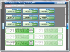
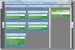
Following on from yesterday’s efforts, I’ve had a solid day on the rest of the load builder interface.
It’s not quite 100% finished yet, I’ve still a few buttons to re-style and I’ve got an idea for an animation to indicate the orders being inserted into a load which I’d like to try and implement.
This is what it use to look like:

Here’s what it looks like now:

Much better!
Spent most of today refining the load builder WPF interface, after returning to the UI after few weeks, I realise I was drunk on the power of round corners and transparency at the time.
I struggled yesterday to come up with a better way to display the condensed order view, no such problem today. It all just fell together, I came up with a neat little trick to fudge a drop shadow with a single line border above or below set to black with 50% alpha.
I’m pretty happy with this part now, next I’ve got to do the same trick on the truck loads these orders go into.


 I’ve had performance issues with my new PC since day one, it’s been all over the place, one minute it’d rip a video at 45FPS next it’d be down to 2FPS, I was thinking it was heat related but sticking a fan in front of it didn’t help.